
The Falmouth & Exeter Students’ Union
Falmouth & Exeter Students’ Union is the only union in the UK to represent students from two Universities: Falmouth University and the University of Exeter in Cornwall. The task was to rebrand the SU while communicating its main values (“I belong”, “I am heard”, “I am supported”, “I realise my potential”), and core behaviours (“professional, caring, and fun”).
The Concept
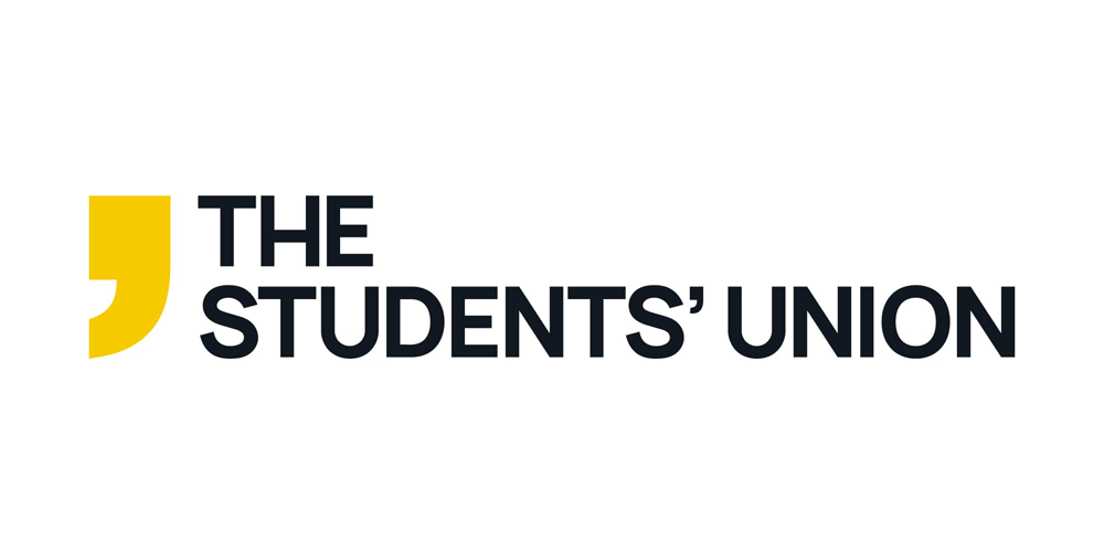
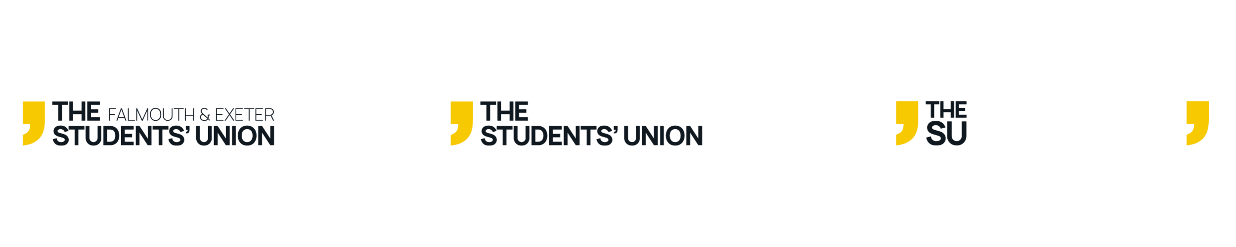
The new logo icon includes an apostrophe, which is a symbol of belonging in the English language. This is to signify that all the students in Cornwall belong to their Students’ Union. Apostrophes can also unite two words, as the SU unites two universities. The colour choice was influenced by Cornwall and its traditional colours (black, gold, and white), with a nod to the beautiful scenery that surrounds the campus in the secondary colour, blue. Four versions of the logo were created, with different size requirement and intended audience. This, combined with the four colour combinations available, makes for a very versatile logo system, with 15 different versions available.
The icon was designed to be a flexible element that could become the central element in various future campaigns. Some basic examples were mocked up.

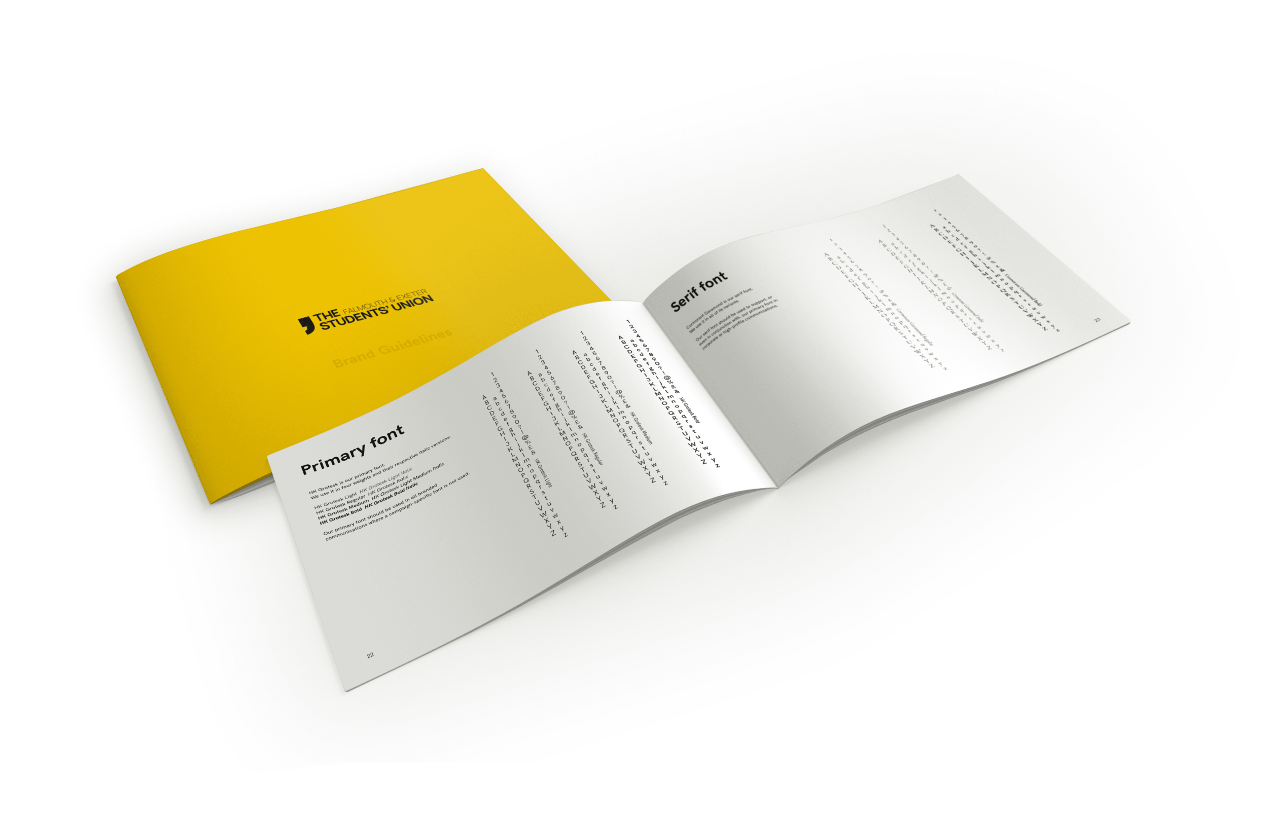
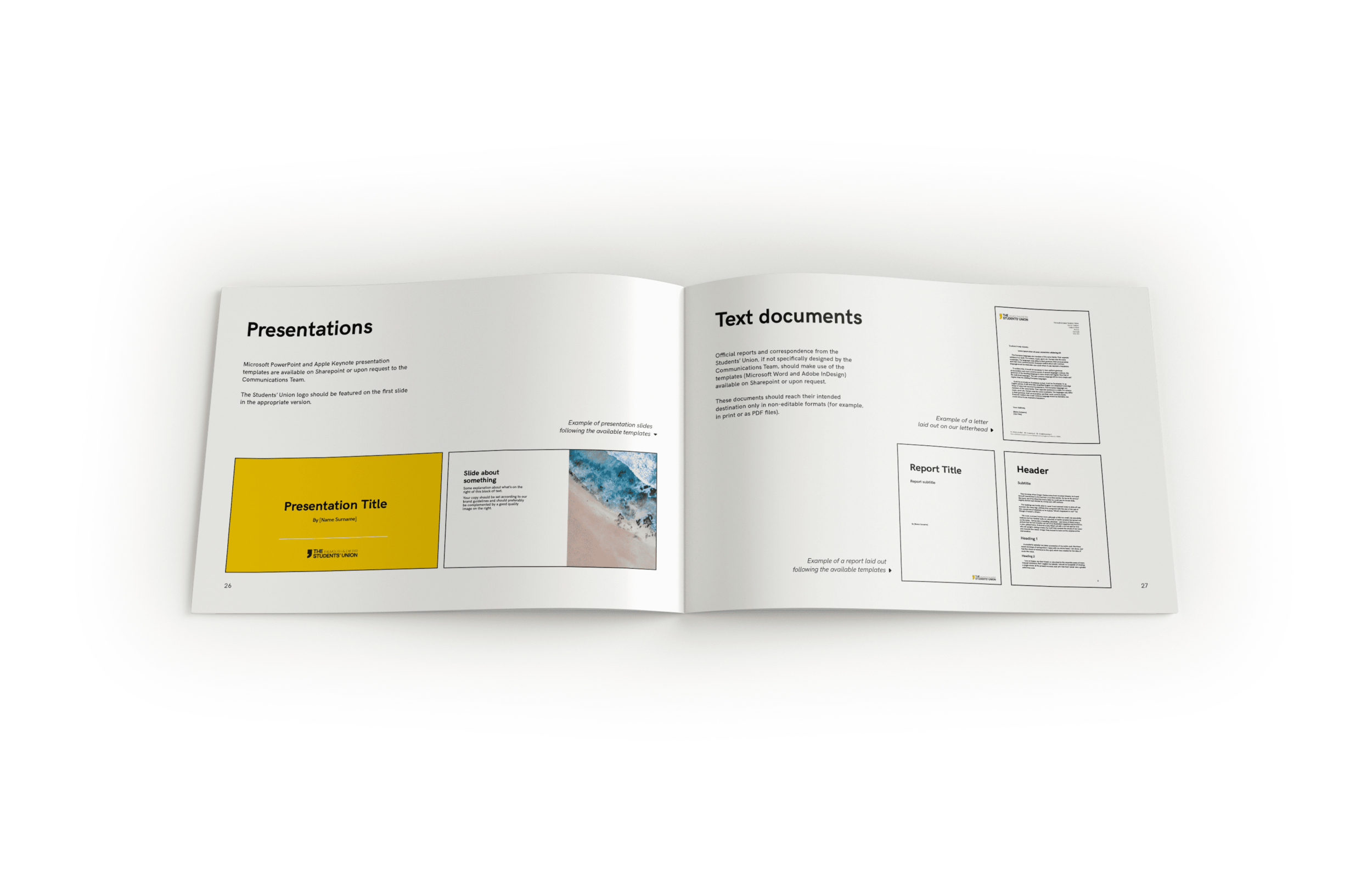
Full brand guidelines were also developed, complete with template examples for documents and presentation, and ready for implementation in September 2019.
I also developed a short animation to present the rebrand to key internal and external stakeholders.
Client
The Falmouth & Exeter Students’ Union
My role
Creative lead & designer